

The extreme weather story of 2026 is not a single storm, a single heatwave, or a single flooded city. It is a pattern.
By early July, the year had already produced a chain of climate signals: record-breaking heat in parts of the Southern Hemisphere, destructive wildfires, severe flooding, near-record global temperatures, a major European heatwave, record sea surface temperatures for the time of year, and a rapidly strengthening El Nino in the tropical Pacific.
None of these events should be treated as proof that every day everywhere is worse than before. Weather is still regional, variable, and messy. But taken together, 2026 is a useful reminder that extreme weather is increasingly connected by a warmer atmosphere and a warmer ocean.
That is why satellite imagery matters. A forecast icon can tell you rain is possible. A warning can tell you heat is dangerous. But a satellite view shows the scale: the cloud bands, storm spirals, smoke plumes, ocean basins, and moving systems that make weather feel less like isolated events and more like one planet-wide process.
2026 Began With Extremes Across Continents
The World Meteorological Organization reported that the start of 2026 was marked by extreme heat, cold, precipitation, and fires. In the Southern Hemisphere, record-breaking heat helped create dangerous fire conditions in Australia, Chile, and Patagonia. Heavy rain in Southern Africa brought severe flooding, especially in Mozambique, with major impacts on lives and livelihoods.
That mix is important. Extreme weather is not only about heat. A warmer climate can amplify different hazards in different places: hotter heatwaves, heavier rain, sharper drought stress, greater wildfire risk, and more damaging compound events when one hazard prepares the ground for another.
The year also continued a strong global temperature trend. NOAA reported that March 2026 tied with 2024 as the second-warmest March on record, with global surface temperature 1.31 degrees C above the 20th-century average. NOAA also said the January-March global surface temperature ranked fourth highest on record and that 2026 was very likely to finish among the five warmest years on record.
Copernicus data told a similar story for late spring. May 2026 was the second-warmest May globally in the ERA5 dataset, 1.42 degrees C above the estimated 1850-1900 pre-industrial average. Boreal spring, from March to May, ranked as the third warmest on record globally.
These rankings are not just trivia. They are the background conditions in which individual weather events unfold.
Ocean Heat Is The Hidden Engine
The ocean is where much of the 2026 story becomes clearer.
On July 1, 2026, the Copernicus Climate Change Service and Copernicus Marine Service reported that daily global sea surface temperatures had exceeded the record levels for the time of year seen in 2023 and 2024. C3S data showed 20.86 degrees C on June 21, just above the 20.83 degrees C observed in 2023 and 2024 for the same time of year. Copernicus Marine data also showed 21.0 degrees C on June 21, about 0.1 degrees C above the previous records.
That may sound like a small number. It is not small when averaged across the global ocean outside the polar regions.
Warmer sea surfaces matter because the ocean feeds the atmosphere with heat and moisture. That can influence tropical cyclones, heavy rainfall, marine heatwaves, and the persistence of warm nights near coasts. Ocean warmth does not create every extreme event by itself, but it changes the environment in which those events develop.
This is one reason satellite-based Earth observation is so useful. From space, the ocean is not empty blue background. It is part of the weather engine.
Europe Shows The Human Side Of Heat
The late June European heatwave made the 2026 pattern painfully visible.
WMO and its partners described the event as an extraordinary heatwave with major impacts on human health, ecosystems, agriculture, infrastructure, and labor productivity. The same report noted that Europe is the world's fastest-warming continent, and that extreme heat is expected to increase in frequency, intensity, and duration as the climate changes.
Several national records and warning milestones stood out. Germany reported 41.7 degrees C at Coschen on June 28. The United Kingdom broke its June temperature record for three consecutive days and issued red warnings for extreme heat for three straight days. The Netherlands reported a new national June temperature record of 39.4 degrees C, and Spain saw multiple June records above 40 degrees C.
The numbers matter, but the health context matters more. Extreme heat is often called a silent killer because it does not always look dramatic from a distance. Warm nights are especially dangerous because the body does not get time to recover. A satellite image can show the broad geography of heat and drought stress, but local heat-health warnings and public health guidance remain essential.
El Nino Adds Another Layer
By early July, WMO said El Nino had developed in the tropical Pacific and was forecast to intensify rapidly into a strong event during July-September 2026. Its seasonal climate update pointed to significant warming across the central and eastern equatorial Pacific, with seasonal sea surface temperature anomalies expected to exceed 2 degrees C in key monitoring regions.
El Nino does not affect every region in the same way. WMO is careful about that: impacts depend on intensity, timing, duration, and how El Nino interacts with other climate drivers. Even so, WMO warned that the developing event would increase the chances of drought, heavy rainfall, heatwaves, and marine heatwaves in many parts of the world.
This is the key point: 2026 is not only a year of individual extremes. It is a year in which large-scale climate drivers are lining up with already elevated global and ocean temperatures.
What Satellite Images Can Help Us Understand
Satellite imagery does not replace forecasts, warnings, or emergency information. It should never be used as the only basis for safety-critical decisions.
But it gives weather context that is hard to get from numbers alone.
A satellite image can show a tropical cyclone as a rotating system rather than a point on a forecast map. It can show smoke spreading across a continent, not just a fire perimeter. It can show cloud bands feeding into a flood-producing storm. It can show the difference between a local shower and a large atmospheric pattern.
That context is useful because extreme weather is often a matter of scale. A flood may be local, but the moisture plume can be regional. A heatwave may hit a city, but the high-pressure pattern can span countries. A wildfire may start from a spark, but the fuel condition is shaped by months of heat, drought, wind, and vegetation growth.
The more connected the atmosphere becomes in our daily lives, the more valuable it is to see the atmosphere as a connected system.
Where LiveAtlas Fits
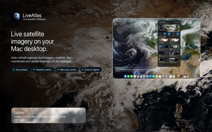
LiveAtlas is built around that simple idea: make real satellite cloud imagery easier to live with on the Mac desktop.
It is not a warning system, and it does not replace meteorological agencies, emergency alerts, or local forecasts. Instead, LiveAtlas gives you a calm visual window into Earth as it changes: cloud fields, daylight, storms, regional satellite views, and the broad atmospheric texture that sits behind daily weather.
For a year like 2026, that kind of ambient view feels especially relevant. The goal is not to make the desktop alarming. The goal is to make the planet visible.
When the atmosphere is quiet, LiveAtlas is a beautiful live wallpaper. When a typhoon forms, a heat dome settles, or a cloud band stretches across an ocean, it becomes a reminder that weather is not just a line in an app. It is a living system moving around us.
The Takeaway
The lesson of 2026 so far is not that every place is experiencing the same disaster. It is that the background state of the planet is changing the odds and character of extremes.
Warmer air can hold more moisture. Warmer oceans can feed storms and marine heatwaves. Heatwaves can stress people, crops, energy systems, and infrastructure. Drought can prepare landscapes for wildfire. El Nino can shift rainfall and temperature patterns across continents.
No single satellite image explains all of that. But satellite imagery helps us see the larger canvas.
And in a year when weather keeps reminding us that Earth is one connected system, seeing the system matters.
Sources
World Meteorological Organization: Extreme heat, cold, precipitation and fires mark the start of 2026
https://wmo.int/media/news/extreme-heat-cold-precipitation-and-fires-mark-start-of-2026
World Meteorological Organization: El Nino is forecast to intensify, increasing likelihood of extreme weather
https://wmo.int/news/media-centre/el-nino-forecast-intensify-increasing-likelihood-of-extreme-weather
World Meteorological Organization / Early Warnings for All: Record-breaking heat spreads through Europe
https://earlywarningsforall.org/media/news/record-breaking-heat-spreads-through-europe
Copernicus Climate Change Service: Surface air temperature for May 2026
https://climate.copernicus.eu/surface-air-temperature-may-2026
Copernicus Climate Change Service and Copernicus Marine Service: Daily global sea surface temperatures break records for the time of year
https://climate.copernicus.eu/copernicus-marine-and-copernicus-climate-change-daily-global-sea-surface-temperatures-break-records
NOAA National Centers for Environmental Information: Assessing the Global Temperature and Precipitation Analysis in March 2026
https://www.ncei.noaa.gov/news/global-climate-202603